[I edited this post on Friday, July 5. See the Addendum at the bottom of the page. –taw]
Well, it was fun while it lasted. I was really rooting for the Time-Lord option for Joel, but Samphire has proved, to my satisfaction at least, that Joel did not jump into his TARDIS and return to Wednesday, June 26.
It’s about time
First, let me explain to the Windows users out there how the Macintosh Menu Bar and Dock behave. In Microsoft Windows, each application has its own menu bar. That is, each window usually has its own bar that contains the standard menu items: File, Edit, View . . . Help. Nonstandard apps like Chrome may break that convention. Each software vendor has the ability to change these user interface characteristics. It’s a free-for-all. Or perhaps a “mess” is a better description.
It isn’t like that on the Mac. The menu bar “belongs” to the operating system. So when each application (e.g., Firefox, Finder, Microsoft Word, etc.) comes to the foreground, its “File-Edit-etc.” menu is anchored to the same place. Apple touts this behavior as a convention that enhances ease of use.
The Dock on the Macintosh is similar to the Windows Taskbar, but with key differences — one of which is the way minimized windows zoom down to the Dock. They remain in a minimized state, visible as a small icon. As with the Windows Taskbar, you can move the Dock to either the side of the desktop, but I think most users keep it on the bottom of the screen.

“Repent, Harlequin!’ Said the Ticktockman
One feature the latest versions of Windows and OS X have in common is the ability to synchronize time with a trusted network host. In the old days, we used to synchronize our servers with “tick” and “tock”: two Network Time Protocol (NTP) servers run by the U.S. Navy. But nowadays, most people in America either use the NTP servers run by NIST or the vendor-operated NTP servers like time.windows.com or time.apple.com.
And that brings us back to the question of time. As you can see from the screenshot of my Macintosh (see Screenshot 1), which shows the Date & Time Preference Panel, I’m letting Apple’s time server act as the trusted date and time reference for my system. You can see that the main application running in the foreground is System Preferences. If I minimize the Date & Time window, it’ll get sucked down into the Dock.

The System Preferences application is still considered to be “in the foreground.” (Incidentally, that’s why we still see the words “System Preferences” next to the Apple icon in Joel’s desktop screen capture.) However, the Date & Time panel is tucked away until I need it again.
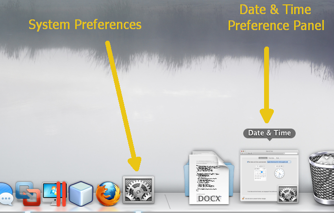
In Screenshot 2, you can see that the minimized icon for the Date & Time Preference Panel is actually a snapshot of exactly what it looked like before I minimized it. And you can tell that it belongs to the System Preferences application, because of the tiny “gears” image pasted in the icon’s lower right-hand corner.
So now that we have all that background knowledge out of the way, let’s take a look at the new evidence that Samphire has just now brought to light.
Watts up, Dock?
Samphire wrote:
I went to Watt’s own full screenshot displayed on his webpage and found that down at the bottom right of his screenshot the minimised icon of the Date & Time icon could be seen (it’s pretty distinctive even when minimised) sitting on the Dock.
Let’s take a closer look for ourselves. Here’s Joel’s desktop image again — cropped and enlarged:
