I posted a familiar looking photo in “Post-Apocalyptic Fiction has been moved to Current Affairs” that I have now replaced with one of the current situation. It reminded me of scenes I had seen in another bushfire year and I thought, “Here we go again” – but no, I have learned that that photo was recycled from a 2013 bushfire in Tasmania.
.

.
And now there is this infographic circulating on Twitter, Reddit and everywhere else, I guess. Infographic.tv awarded it one of “the best”. The critical comment comes from cupboard.com.
.
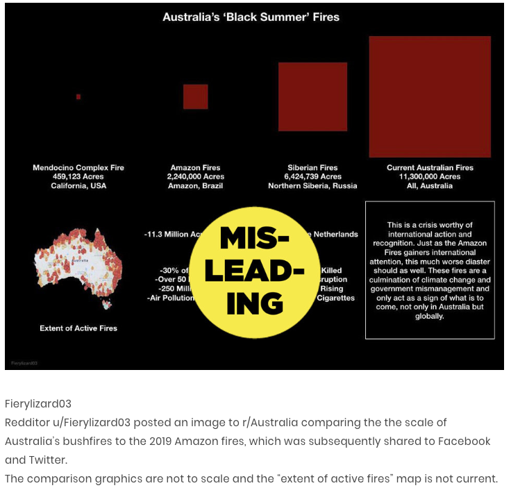
Here is my own “infographic” based on the same data. Bear in mind I am no mathematician so more mathematically endowed readers are welcome to offer corrections:

Bottom row — the scales as depicted in the infographic, all compared with California. Top row — a truer representation according to the figures (my rough calculation).
.
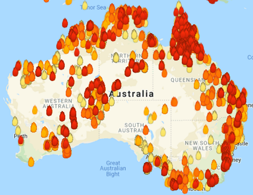
Certain maps hit home as definitely misleading from the moment I saw them. They do not represent what is happening now. They “point” to areas where we have had bushfires since September 1919, and the “pinpointing” is with a thick marker pen rather than a precision pen.
.
.
.
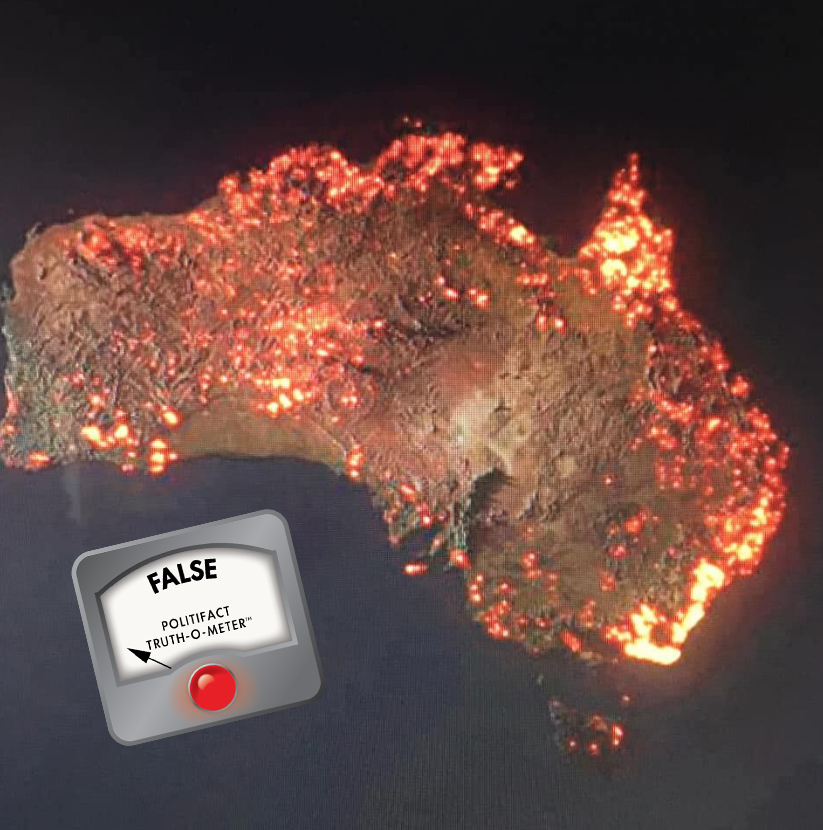
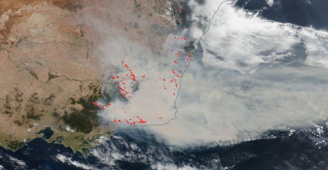
Here’s a more realistic satellite image of where the most serious threats are at the moment:
.
There are other more informative maps for residents, too, on the various state fire service sites. These are bad enough:
.
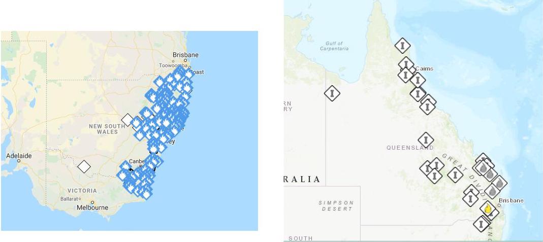
Right: Qld Rural Fire Service current map
.
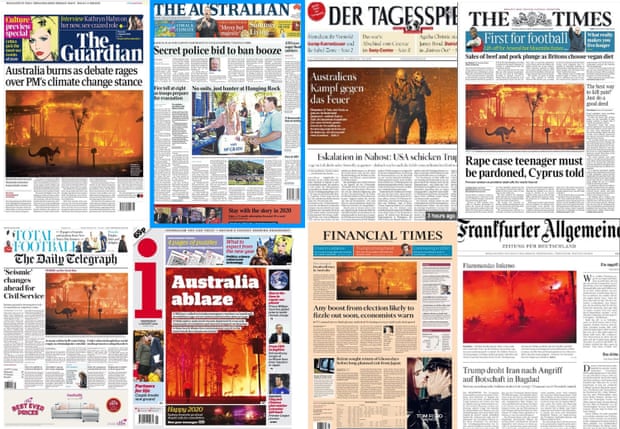
I can see the climate change deniers (who include our current political leaders in the pockets of the coal industry and Pentecostal faith) eventually standing up for Murdoch’s media coverage as some more “realistic” perspective:
.