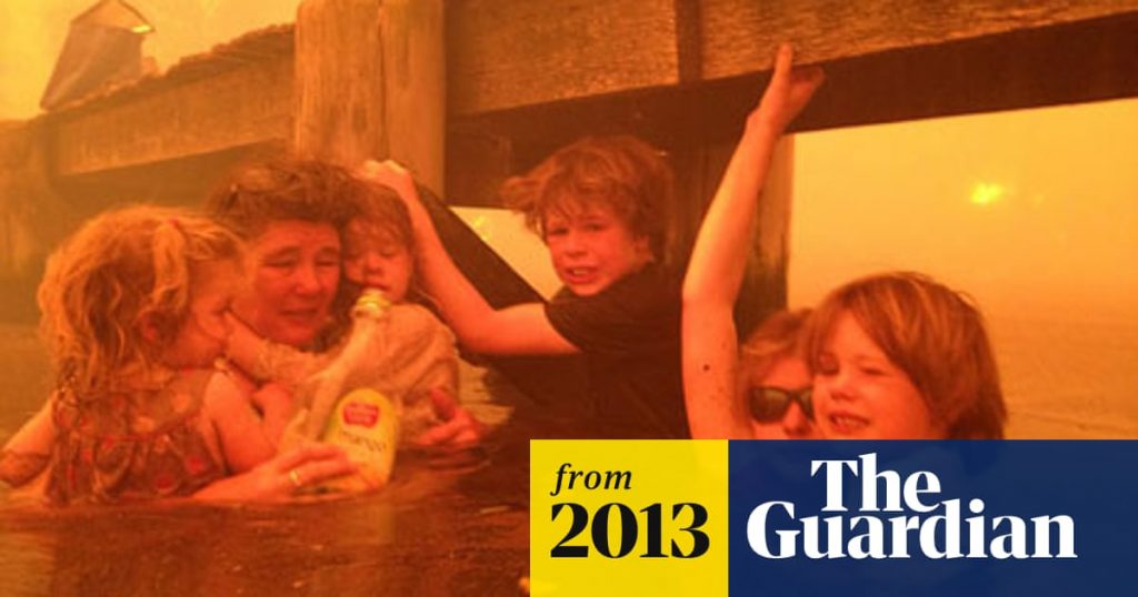
I posted a familiar looking photo in “Post-Apocalyptic Fiction has been moved to Current Affairs” that I have now replaced with one of the current situation. It reminded me of scenes I had seen in another bushfire year and I thought, “Here we go again” – but no, I have learned that that photo was recycled from a 2013 bushfire in Tasmania.
.
.
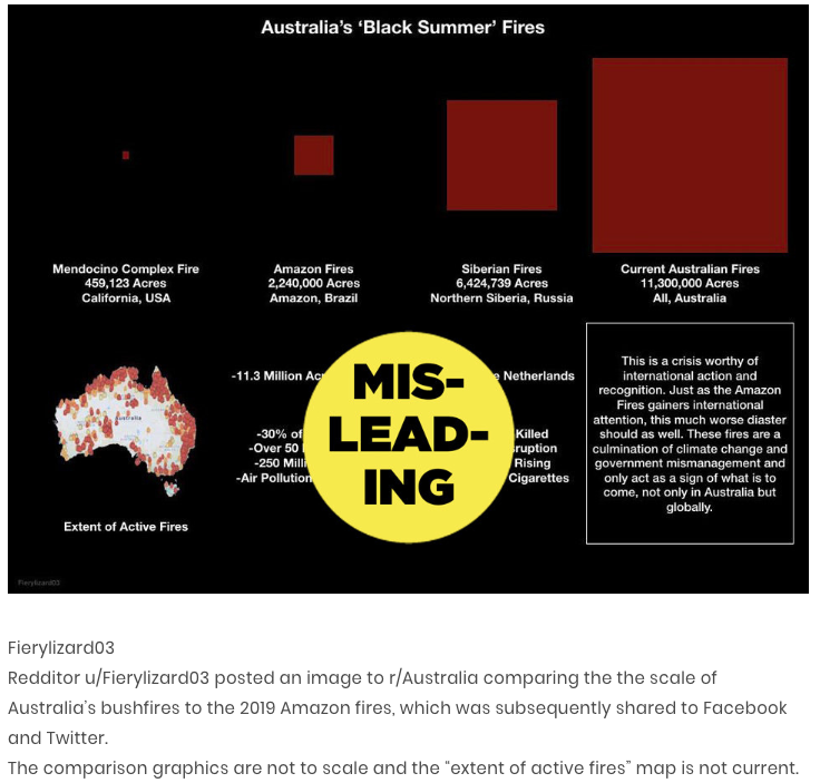
And now there is this infographic circulating on Twitter, Reddit and everywhere else, I guess. Infographic.tv awarded it one of “the best”. The critical comment comes from cupboard.com.
.
Here is my own “infographic” based on the same data. Bear in mind I am no mathematician so more mathematically endowed readers are welcome to offer corrections:

Bottom row — the scales as depicted in the infographic, all compared with California. Top row — a truer representation according to the figures (my rough calculation).
.
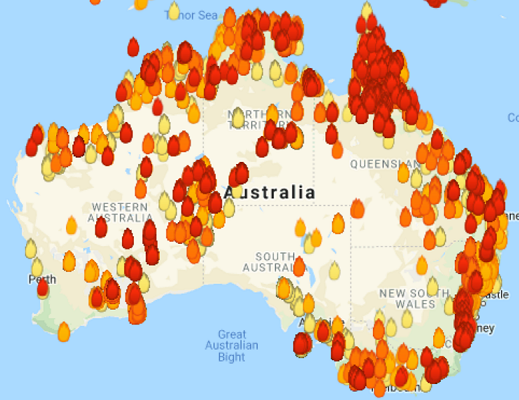
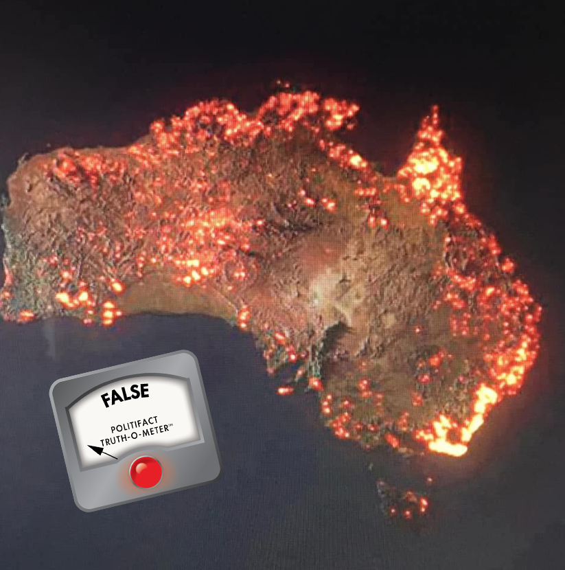
Certain maps hit home as definitely misleading from the moment I saw them. They do not represent what is happening now. They “point” to areas where we have had bushfires since September 1919, and the “pinpointing” is with a thick marker pen rather than a precision pen.
.
.
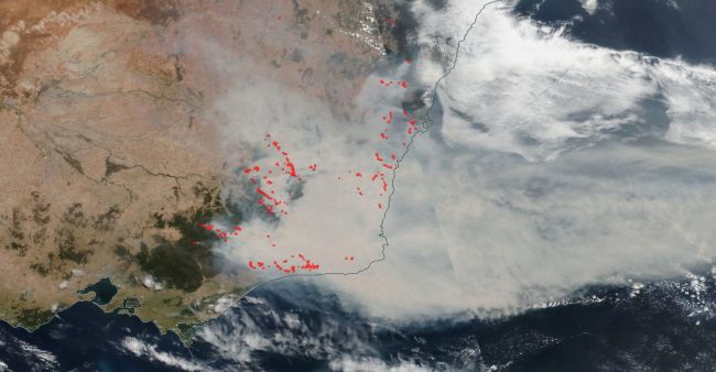
Here’s a more realistic satellite image of where the most serious threats are at the moment:
.
There are other more informative maps for residents, too, on the various state fire service sites. These are bad enough:
.
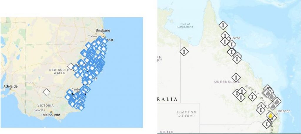
Right: Qld Rural Fire Service current map
.
I can see the climate change deniers (who include our current political leaders in the pockets of the coal industry and Pentecostal faith) eventually standing up for Murdoch’s media coverage as some more “realistic” perspective:
.

If you enjoyed this post, please consider donating to Vridar. Thanks!

THE EMERGING SCIENTIFIC TRUTH REGARDING HUMAN-INDUCED CLIMATE CHANGE
Admittedly, most climatologists believe in anthropogenic global warming (AGW) but your organization overlooks (intentionally?) the fact that most astrophysicists insist that our Sun is the main driver of any warming and these solar scientists have asserted that the Earth will be cooling over the coming years due to a Grand Solar Minimum which begins in 2020. The last IPPC report asserts that CO2 is the cause of over 50% of the warming since 1850 but Prof. Judith Curry contends that CO 2 is the cause of less than 50% of the historic warming.
Recently, Prof. Nir Shaviv has contended that our Sun has driven about 67% of our planet’s recent warming while AGW has accounted for at most 33% of the recent increase in the average worldwide temperature. Subsequently, a Finnish paper (that has yet to be accepted for publication) asserted that humans accounted for at most 10% of any warming. In July 2019 Prof. Hyodo of Kyoto University and his team of investigators reported in a top scholarly peer-reviewed scientific journal (Nature) that AGW accounted for very little of any recent warming. They instead suggested that the “cloud umbrella effect” was the major contributor to an increase in temperature. Next, in August of 2019, a paper by Prof. Wu of China’s National Academy of Science and her team was accepted for publication in an important peer-reviewed journal and this research found no evidence of any human-induced warming. Their research confirmed the findings of an earlier 2014 scholarly paper. Then in September of 2019, a letter signed by over 700 climate experts was delivered to the UN Secretary-General insisting that “NO CLIMATE EMERGENCY EXISTS” (emphasis in the original). Interestingly, this letter came to life in Italy and most of the signatories are from Europe. Couple this with the 145 US “deniers” and the size of the entire group becomes very compelling. In an October paper published in the scientific journal, “Geology”, it was reported that climate change and ocean acidification has occurred before the appearance of hominoids on our planet.
It is quite revealing that the climate alarmists readily depict (in graphic form) the correlation of the “temperature anomaly” with the concentration of CO2 in Earth’s atmosphere but they never produce a graph of the worldwide average temperature itself over the past 150 years. They avoid this compelling display because this graph (which they never show) would demonstrate a virtual flatline revealing almost no increase and thereby severely undermining their strident claims of a “climate emergency”. Please see my final link and look at minutes from 6:00 to 8:00.
Lastly, in November, five papers from the Federal University of Sao Paolo came to light which confirmed the veracity of this other research. In Oct. 2019 David Attenbougher stated publically that the BBC has lost its reputation for reporting the scientific facts accurately. Thus, it is longer possible to rely on the mainstream media regarding the truth about climate change. The following Table and Graph show the facts:
Based upon these very latest scientific findings the case for the claim of AGW is starting to crumble before your eyes.
LINKS
For those who require links here are several:
https://www.scmp.com/news/china/science/article/3022136/china-scientists-warn-global-cooling-trick-natures-sleeve
https://www.pnas.org/content/116/51/25369
https://www.youtube.com/watch?v=JyyuouPSNEAagencia.fapesp.br/a-novel-method-for-analyzing-marine-sediments-contributes-to-paleoclimate-reconstitution/31850/
https://agupubs.onlinelibrary.wiley.com/doi/abs/10.1029/2019PA003691
https://www.sciencedaily.com/releases/2019/07/190703121407.htm
https://www.ncbi.nlm.nih.gov/pmc/articles/PMC4205841/
https://www.ncbi.nlm.nih.gov/pmc/articles/PMC4215299/
https://www.youtube.com/watch?v=QIDoMPIikog
https://phys.org/news/2019-12-cooling-role-particulate-earth-stronger.html
https://www.autoblog.com/2019/12/09/climate-change-policies-costly-company-value/
“Calcium isotope evidence for environmental variability before and across the Cretaceous-Paleogene mass extinction” by Benjamin J. Linzmeier, et. al. 28 October 2019, Geology.
https://arxiv.org/pdf/1907.00165.pdf
https://www.youtube.com/watch?v=NX_nqbasMo0&t=163s
https://www.youtube.com/watch?v=H_vpIVABNQI
https://www.youtube.com/watch?v=_2Bw52FjYi4
https://www.youtube.com/watch?v=lB94hkuO4KQ
https://www.youtube.com/watch?v=S50_juP5S5U
Kinda like lying for Jesus, if you know you are on the side of right, “truish” is close enough.
For statistical information regarding climate change this is, IMO, the single best site for a layman like me.
https://tamino.wordpress.com/
In the current topic [‘Bushfire and Homophobia’] a commentater has posted the explanation of that red fiery graph/map [see comment by “bindidon”].
Well, well — looks like I scooped even the ABC with this post:
The truth behind the ‘misleading’ fire maps that have gone viral during Australia’s bushfire crisis
Though I think I like the original title better: How ‘misleading’ viral bushfire maps have been fooling the world